
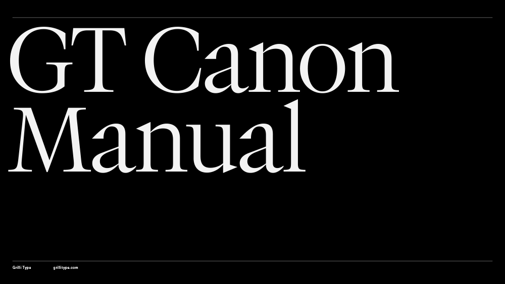
GT Canon’s design is pragmatic but not static: movement and liveliness are embedded in the letterforms. It is our answer to what our digital times require of a serif today. It’s what a contemporary serif should be in both form and function. Like its sans serif sibling, GT Standard, it aims for modern functionality rather than stylistic reinvention.
Resource download
PriceVIP only
Only VIP downloadUpgrade VIP
Buy now
Comments0